How to customize your app home page ?
The home page is one of the main pages of your app. The Home page contains several key components that help you build your app perfectly.
Those components are,
Now let's study each of those components.
01. Text
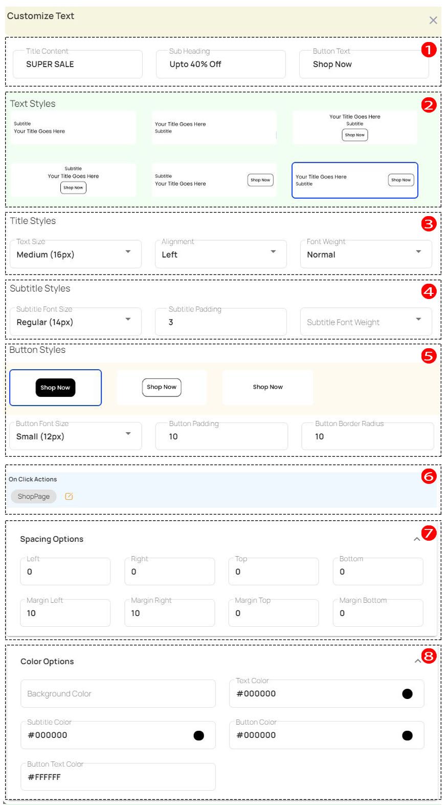
| 01 | Content |
You can change the Content from here. There are 03 main parts of the content. If they are Title content, Sub heading, Button text. |
| 02 | Text Styles |
You can change the Text Style from here. 06 designs belong to this category. You can choose one style from them. |
| 03 | Title Styles |
In title styles, you can change Text size, Alignment and Font weight. |
| 04 | Subtitle Styles |
In subtitle styles, you can change the Subtitle font size, Subtitle padding and Subtitle font weight. |
| 05 | Button Styles |
From button styles you can change Button style, Button font size, Padding and Border radius. But to do that you need to choose a style that comes with the Button from Text Styles. |
| 06 | On Click Actions |
The onClick action allows you to access the app's pages or other web pages. |
| 07 | Spacing Options |
You can change spacing options from here. It includes Left, Right, Top, Bottom, Margin Left, Margin Right, Margin Top, Margin Bottom. |
| 08 | Color Options |
In the color options section, you can change the Background Color, Text Color, Subtitle Color, Button Color and Button Font Color. |
02. Image
| 01 | Style |
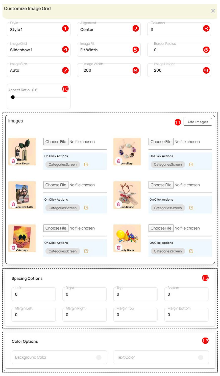
You can change the image style from the style section. |
| 02 | Alignment |
You can change the image alignment from the alignment section. |
| 03 | Columns |
The number of columns can be changed from this. |
| 04 | Image Grid |
You can change its type from Image Grid. |
| 05 | Image Fit |
You can change the image fit type here. It includes cover, contain, fill, fit height, fit width. |
| 06 | Border Radius |
Change the border radius size in this section. |
| 07 | Image Size |
You can change the image size type from this section. |
| 08 | Image Width |
Change the width of the image from here. |
| 09 | Image Height |
Change the height of the image from here. |
| 10 | Aspect Ratio |
Here you can change the aspect ratio you want. |
| 11 | Add Images |
You can add new images or modify current images for the image grid. And you can add onclick actions for images. The onClick action allows you to access the app's pages or other web pages. |
| 12 | Spacing Options |
You can change spacing options from here. It includes Left, Right, Top, Bottom, Margin Left, Margin Right, Margin Top, Margin Bottom. |
| 13 | Color Options |
In the color options section, you can change the Background Color and Text Color. |
03. Slider
| 01 | Slider Type |
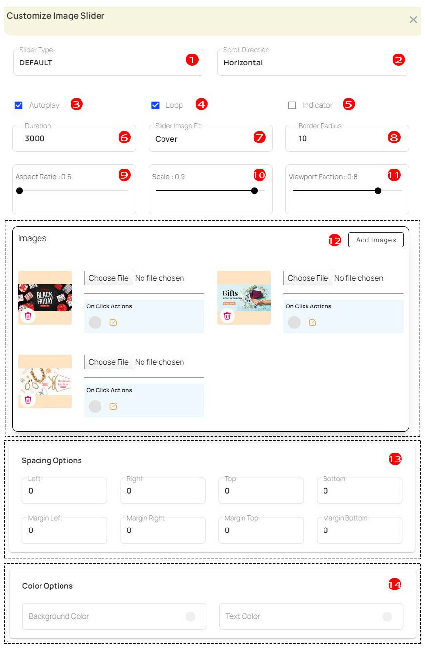
You can change the slider type from here. It includes Default, Stack, Tinder and Custom. |
| 02 | Scroll Direction |
You can select Horizontal or Vertical for the scroll direction type. |
| 03 | Autoplay |
If you want to autoplay the slider, click the Autoplay button to activate it. |
| 04 | Loop |
If you want to loop the slider, click the loop button to activate it. |
| 05 | Indicator |
If you want to put an indicator on the slider, click the indicator button to activate it. |
| 06 | Duration |
You can change the slider duration from here. |
| 07 | Slider Image Fit |
You can change the slider image fit type here. Its include cover, contain, fill, fit height, fit width. |
| 08 | Border Radius |
Change the border radius size in this section. |
| 09 | Aspect Ratio |
Here you can change the aspect ratio you want. |
| 10 | Scale |
You can change the image slider scale size from this section. |
| 11 | Viewport Faction |
You can resize the viewport faction from this section. |
| 12 | Add Images |
You can add new images or modify current images for the images. And you can add onclick actions for images. The onClick action allows you to access the app's pages or other web pages. |
| 13 | Spacing Options |
You can change spacing options from here. It includes Left, Right, Top, Bottom, Margin Left, Margin Right, Margin Top, Margin Bottom. |
| 14 | Color Options |
In the color options section, you can change the Background Color and Text Color. |
04. Product
| 01 | Style |
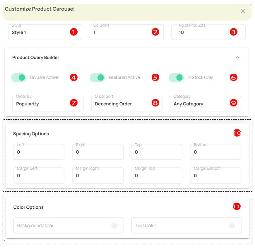
You can change the product carousel style from the style section. |
| 02 | Columns |
The number of columns can be changed from this. |
| 03 | No of Products |
You can change the number of products in the carousel from this section. |
| 04 | On Sale Active |
You can enable the toggle button to show on-sale active products. |
| 05 | Featured Active |
You can enable the toggle button to show featured active products. |
| 06 | In Stock Only |
You can enable the toggle button to show in stock only products. |
| 07 | Order By |
This allows you to change the order by category. It includes elements like popularity, price, date and none. |
| 08 | Order Sort |
This allows you to change the order sort type. The order sort attribute includes Ascending Order & Descending Order. |
| 09 | Category |
This allows you to change the category type for your products. For this, the product categories on your WooCommerce website will be loaded. |
| 10 | Spacing Options |
You can change spacing options from here. It includes Left, Right, Top, Bottom, Margin Left, Margin Right, Margin Top, Margin Bottom. |
| 11 | Color Options |
In the color options section, you can change the Background Color and Text Color. |
05. Category
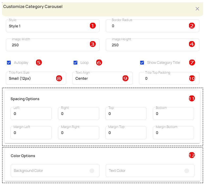
| 01 | Style |
You can change the category carousel style from the style section. |
| 02 | Border Radius |
Change the border radius size in this section. |
| 03 | Image Width |
Change the width of the image from here. |
| 04 | Image Height |
Change the height of the image from here. |
| 05 | Autoplay |
If you want to autoplay the category carousel, click the Autoplay button to activate it. |
| 06 | Loop |
If you want to loop the category carousel, click the loop button to activate it. |
| 07 | Show Category Title |
If you want to show the category title in the carousel, click the show category title button to activate it. |
| 08 | Title Font Size |
You can change the title font size from here. It includes Tiny (10px), Small (12px), Regular (14px), Medium (16px), Large (18px), X-Large (20px), XX-Large (24px). |
| 09 | Text Align |
You can change the text align type from here. It includes Left, Right, Center. |
| 10 | Title Top Padding |
Using this section, you can change the size of the title top padding. |
| 11 | Spacing Options |
You can change the spacing options from here. It includes Left, Right, Top, Bottom, Margin Left, Margin Right, Margin Top, Margin Bottom. |
| 12 | Color Options |
In the color options section, you can change the Background Color and Text Color. |
06. Search
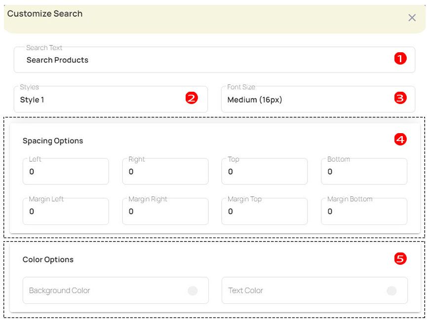
| 01 | Search Text |
Change the search text from this section. |
| 02 | Style |
You can change the search text style from the style section. |
| 03 | Font Size |
You can change the search text font size from here. It includes Tiny (10px), Small (12px), Regular (14px), Medium (16px), Large (18px), X-Large (20px), XX-Large (24px). |
| 04 | Spacing Options |
You can change spacing options from here. It includes Left, Right, Top, Bottom, Margin Left, Margin Right, Margin Top, Margin Bottom. |
| 05 | Color Options |
In the color options section, you can change the Background Color and Text Color. |
07. Countdown
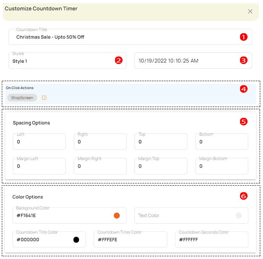
| 01 | Countdown Title |
Change the countdown title from this section. |
| 02 | Style |
You can change the countdown style from the style section. |
| 03 | Date & Time |
Select the date and time for your countdown timer. |
| 04 | On Click Actions |
You can add on-click actions for the countdown timer. The onClick action allows you to access the app's pages or other web pages. |
| 05 | Spacing Options |
You can change spacing options from here. It includes Left, Right, Top, Bottom, Margin Left, Margin Right, Margin Top, Margin Bottom. |
| 06 | Color Options |
In the color options section, you can change the Background Color and Text Color, Countdown Title Color, Countdown Timer Color and Countdown Seconds Color. |
Now we think you will have no problem customizing the home page.